

Welcome to
ENTER is a website for local small businesses that people can find and support local independent small businesses as well as they can sell on ENTER. The typical user is between 14-40 years old and most are college students or early career professionals. ENTER is designed to make shopping interesting, fast, and easy for all types of users. The site allows users to shop for variety of products from local small business owners.
Target Users
People who love to shop online and support local affordable products, People who love to start on small business, busy shoppers of all genders and backgrounds who want to have a fast, fun experience.
Research conducted and the research findings
We conducted user research and received feedback from users that we incorporated into user personas. For example, our user persona, Ben, is a 22-year old product development intern who shops online to give someone meaningful gifts. The research revealed that Ben was frustrated by cluttered navigation and out-of-date product information that made shopping confusing and annoying. We also learned that Ben often receives incorrect sizes. Ben would like to see improvements to the app, like bigger buttons, simple icons, and minimal design. Since Ben shops for pleasure, they would also like to see more options that suggest different pieces and allow them to browse by featured pieces.
So, what’s the problem?
Currently, the site has a busy design that sometimes feels a bit cluttered, isn’t very engaging, and needs to be improved for a better shopping experience.
Insights learned
From user research, we learned that there were some pain points for users. The two biggest issues were the size of buttons and the types of icons used on mobile devices. The small buttons caused users to select incorrect sizes and colors. We solved this issue by making bigger buttons and the icons simpler. We also learned that users wanted a more enjoyable experience browsing for clothing. They commented that the site felt too busy. They also said that sometimes they came to the site without a specific item in mind. We solved this by making the homepage simple and engaging for the user by adding the clothing carousel to bring specific items to the user’s attention. This made the browsing experience more enjoyable, which helped meet the user’s needs.
UI Ideation: sketches and wireframes
Here’s how we put our users’ needs first. The process below begins with our initial idea wireframes, then moves to mockups, and finally to the high-fidelity prototype.
Wireframes
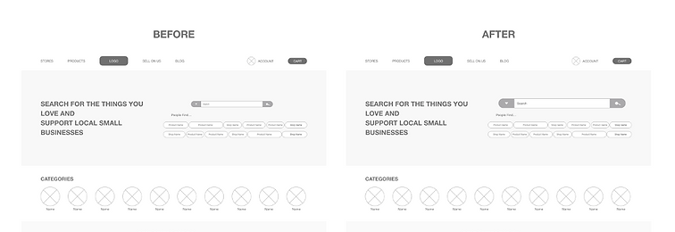
In this simple version, you can see how the designer approaches solving the user’s needs. The search bar is big and there is also a recommendation what people find in the current time. There are landmarks listed to show where things such as the shopping cart will be. There is a place for a horizontal slide which will display different categories, which gives the user an opportunity to browse for a more enjoyable user experience.

Revised wireframes after low-fidelity prototype usability testing:
In the revised version, you see the progression of the design based on insights identified from usability test feedback. Design additions include bigger space to allow for the ability to search and a prompt for users to log in to their account if they have one.
Mockups
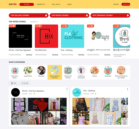
Now the design really begins to take shape: actual text is used, colors are applied, and images are added. This mockup shows a visual that gives a better idea of the final design.

High-fidelity prototype
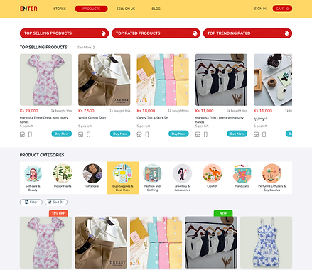
The design is fully developed and gives a complete picture of the completed design. It addresses the user’s needs for a simple, yet engaging and uncluttered design.
